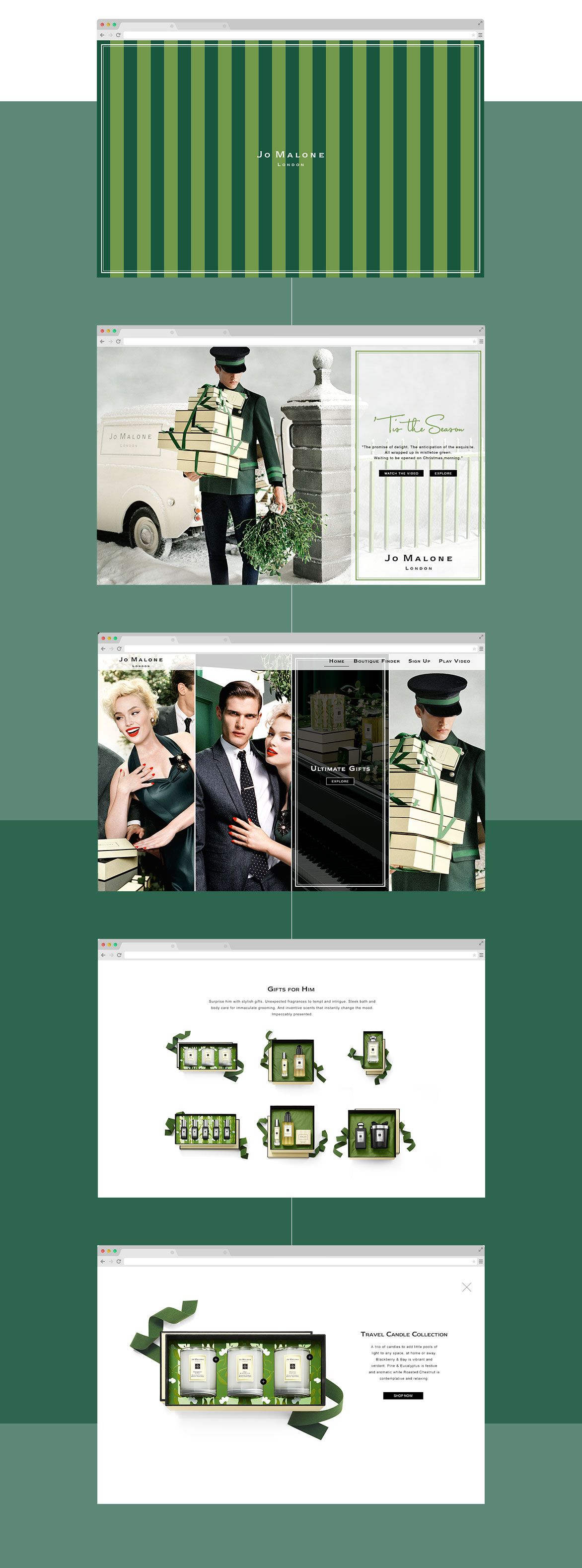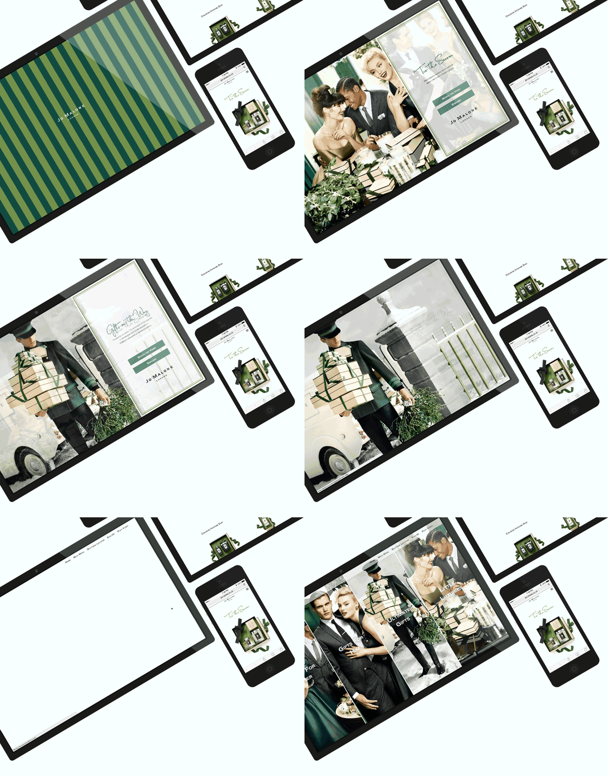
The Magalogue is an off the shelf mini catalogue that features Jo Malone's current Christmas releases. This can then be deployed to any region or retailer and easily localised to suit their needs.
We were able to rebuild the entire solution and replace the structure with a lightweight, fully responsive architecture resulting in the Magalogue being faster and easier to localise than ever before.
MY ROLE
My Role was to work closely with a global online team to prototype, test, design and develop their desired solution.
THE APPROACH
We nailed down all the initial requirements to determine what it was the brand wanted to achieve with the magalogue for this year. We also reached out to regions that had taken the previous solution to build a functional spec on what had worked well and what needed improvement from their perspective.

NEXT STEPS
After our initial briefing meetings, we had a long list goal the brand wanted to achieve with the solution. One is to really promote the products more than they had with previous solutions and another for the solution to be easy to navigate on mobile.
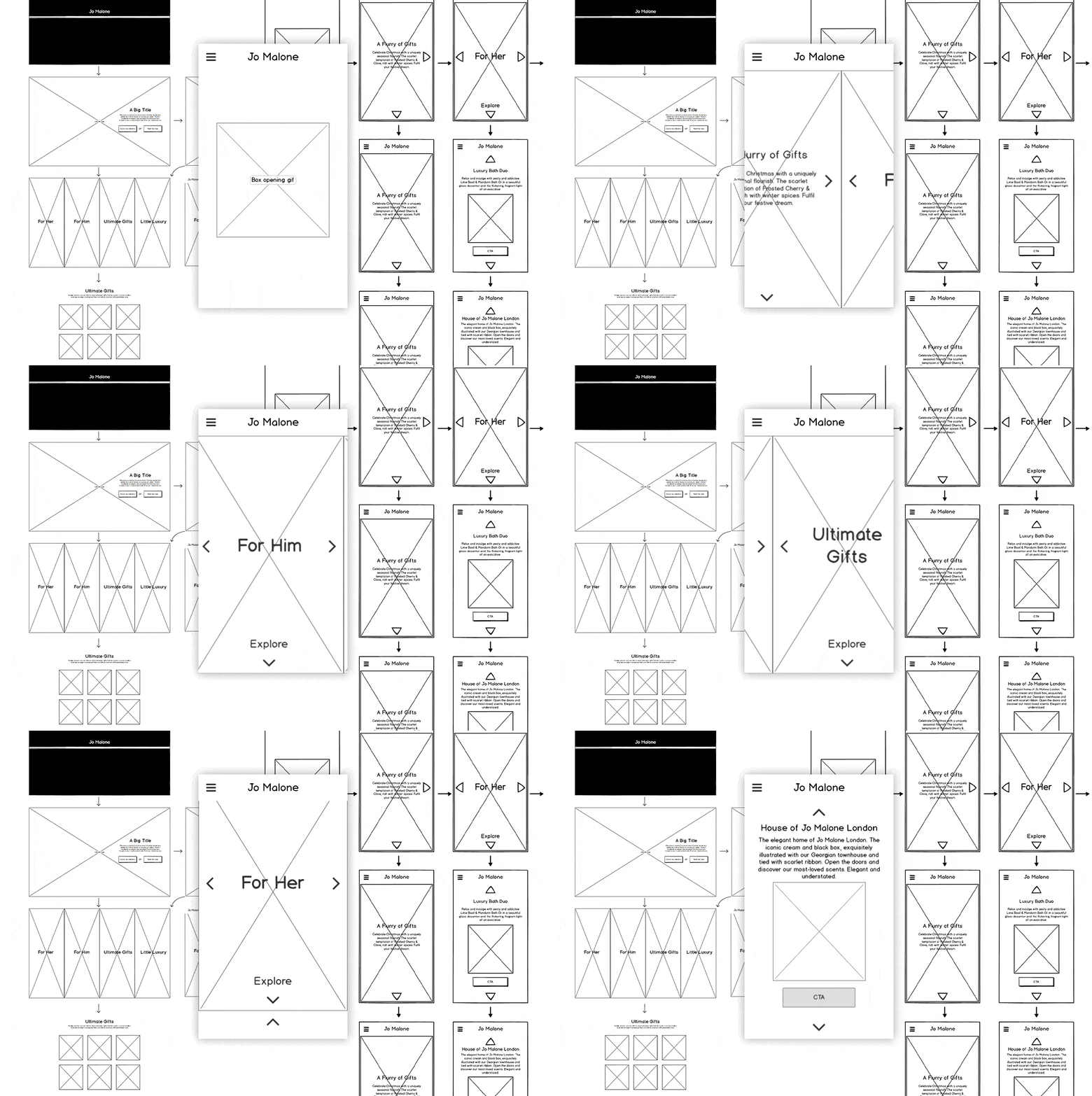
We moved straight into building out mobile interactive wireframes instead of statics to help visualise a solution for testing functionality and flow. After the mobile prototype was presented back and a theory for larger screen solutions demonstrated, we moved into adapting the mobile prototype for further use.

SECOND TIME LUCKY
The Solution for FY16 was to redesign and rebuild the existing solution. This gave us the chance to address some core fundamentals in user experience and site architecture across different devices.
Although a CMS GUI was out of scope for this build we built a controlling .json file for the entirety of the site contents. Although this wasn't the user-friendly solution it was a good compromise to ensuring the integrity of the HTML structure of the pages.

FINAL TOUCHES


