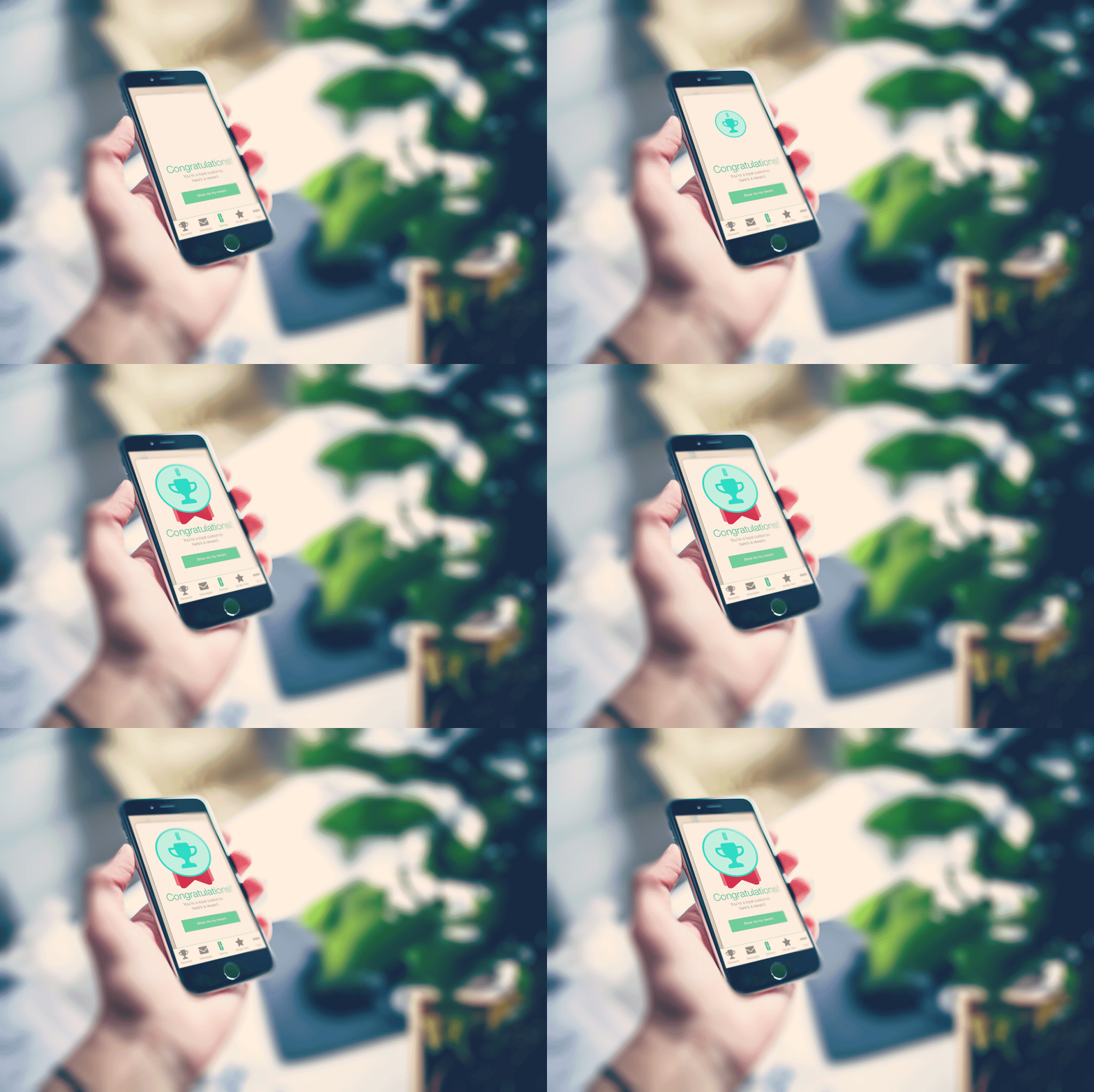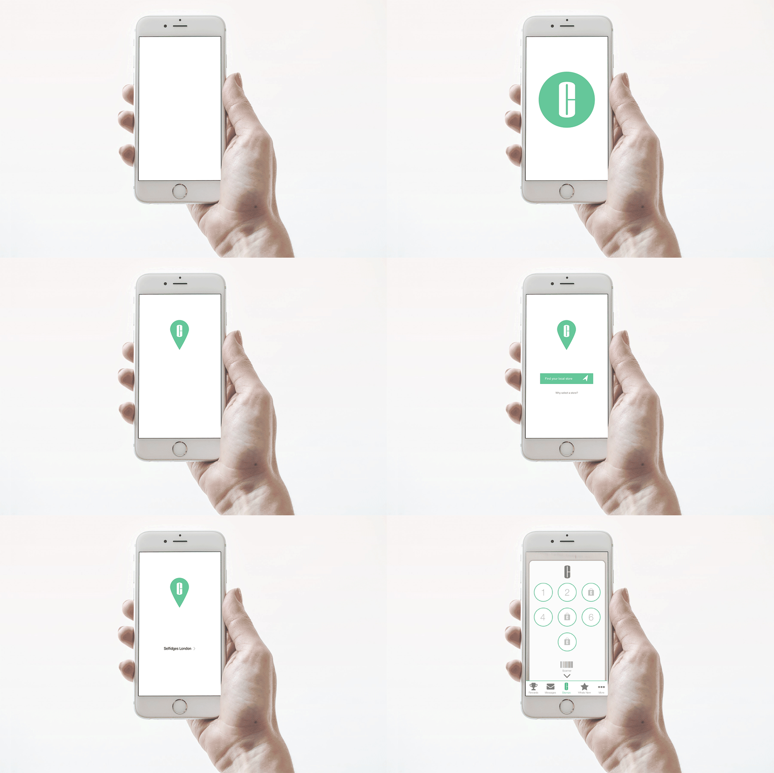
Clinique had teamed up with Selfridges to offer its own loyalty system for kiosks located within a Selfridges store. Instead of offers a loyalty card that could be easily lost or put through the wash it had been decided to build a dedicated app.
Clinique had gone through some branding changes so the app needed a refresh and v1.0 had only ever been designed as a proof of concept, this was version 2.0.
MY ROLE
This was a 3-month project so along with a developer and brand we rebuilt this app from the ground up. Specs, Flows, Wires, Prototypes, Mocks, Animations we did the lot.
KICK OFF
I spent time in stores with the Clinique observing how the current app was used, asking customers questions, and building paper prototypes to test concepts while out in the field to see what works.
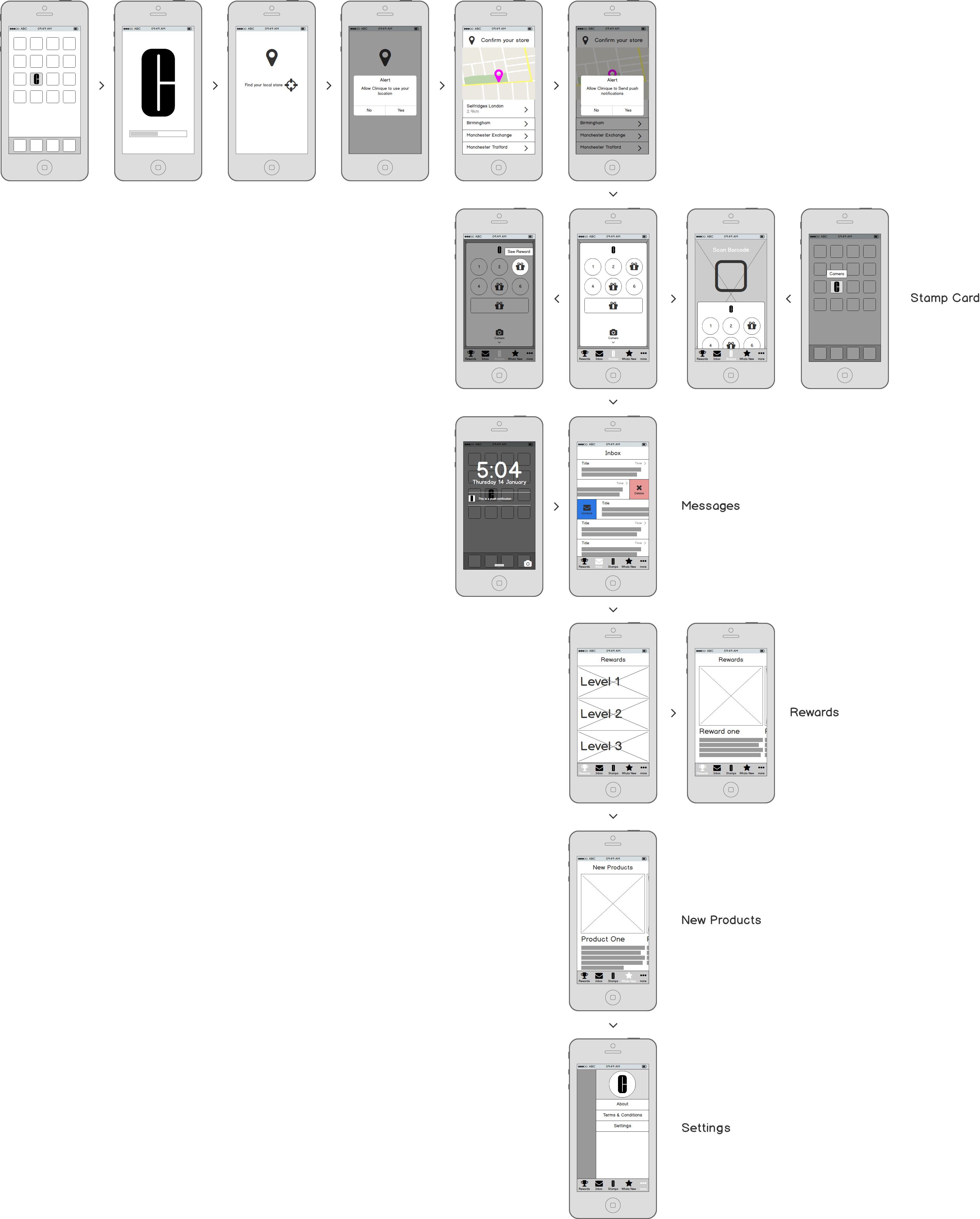
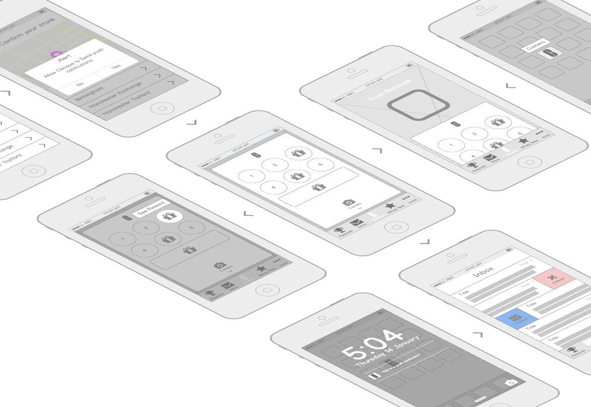
All the feedback from out on the counters was brought back into some neater wires, prototyped and tested.
EASY TO MANAGE
v1.0 worked ok for the customer but still had a few usability issues, it was also slow to update any content on the app. V2.0 was the chance to fix some of the observed issues from both customer and business aspects. We scoped for this version to be totally configurable so brands could change the loyalty options and content of the app. They also wanted a way to talk to users within the vicinity of a shop so we took some time to build in a few geolocation features.
SIMPLE
We wanted this app to feel more integrated into its native device. It had to feel like Clinique so we reused some of the native UI and gave it some Clinique style, allowing the animations and interactions to bring life to the app. More utilitarian aspects kept the same style and functionality as it's native host.
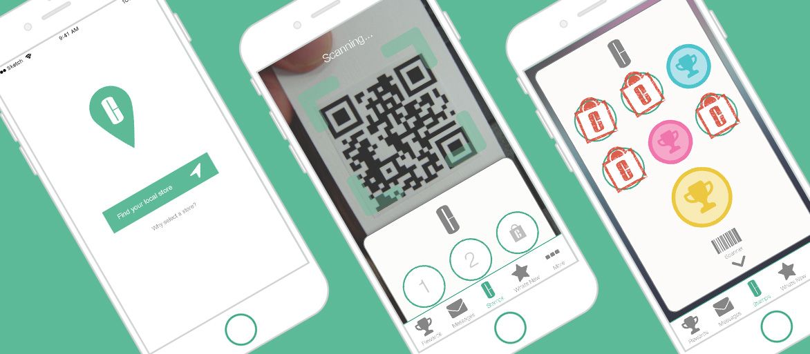
We brought the nav out into a footer bar so navigation and current location within the app were clearly visible. The main function of the app is the reward card so that became the centrepiece with the second function of the camera hiding behind it and simply needing a swipe to access it.
REWARDS MAKE THE HEART GROW FONDER
We all want instant gratification for when we've achieved something. This app was no different, we wanted the user to know they had achieved a free gift thanks to their loyalty so we called it out as soon as the user had received the required number of stamps.
