
Choose Wisely is a comparison site based on simple values, providing the user with the best possible comparison experience so they get matched with the most relevant products for them. No fuss and no data selling.
MY ROLE
I had the privilege to be working with the amazing team from Ratio for this project. I was put on to Choose Wisely after the initial alpha stage of the project to help with usability, branding, and development.
THE APPROACH
Designing Choose Wisely had to be very user orientated, getting the user from A to B as quickly as possible while providing them with the most relevant data.
We intercepted a number of people in a local shopping centre and asked them questions about their experience buying financial products.
Combining this with previous customer research helped us build some personas and write our requirements for journeys and page architecture.
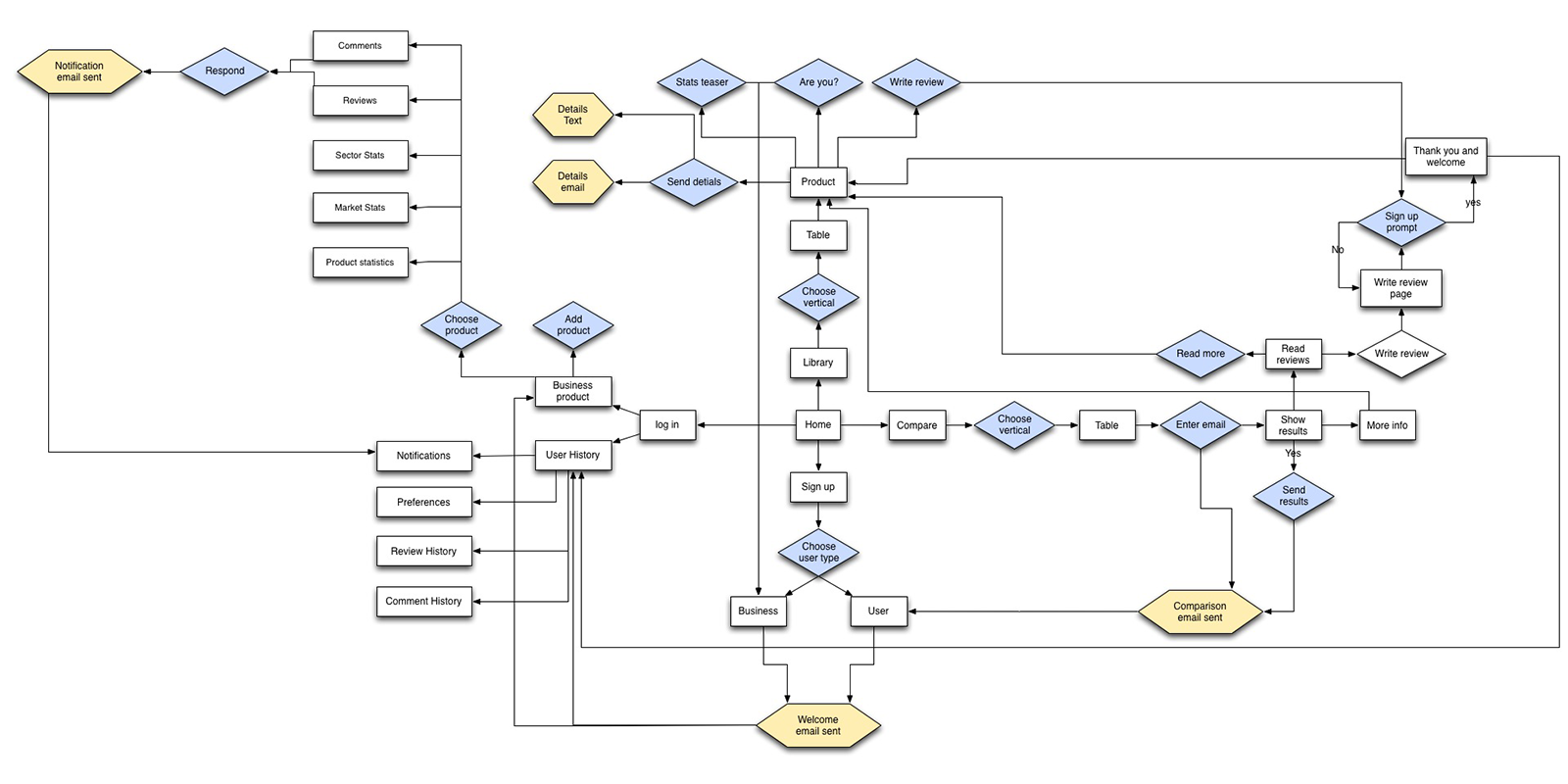
Findings from our research also helped identify opportunity areas where previous customers had expected something to happen but it never did. so we scoped and built those in.
WEB DESIGN DONE RIGHT
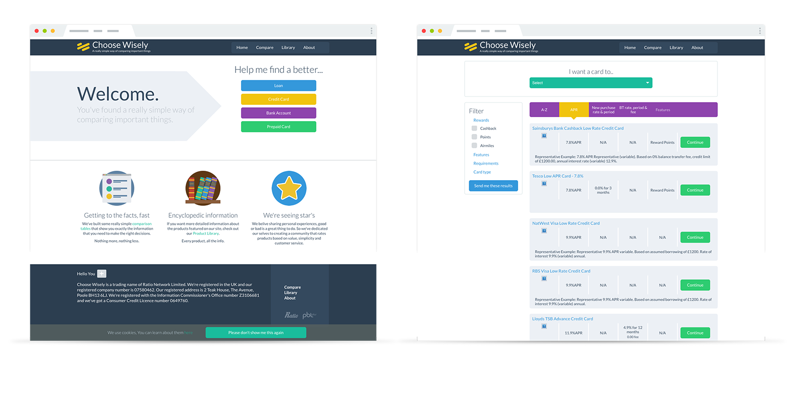
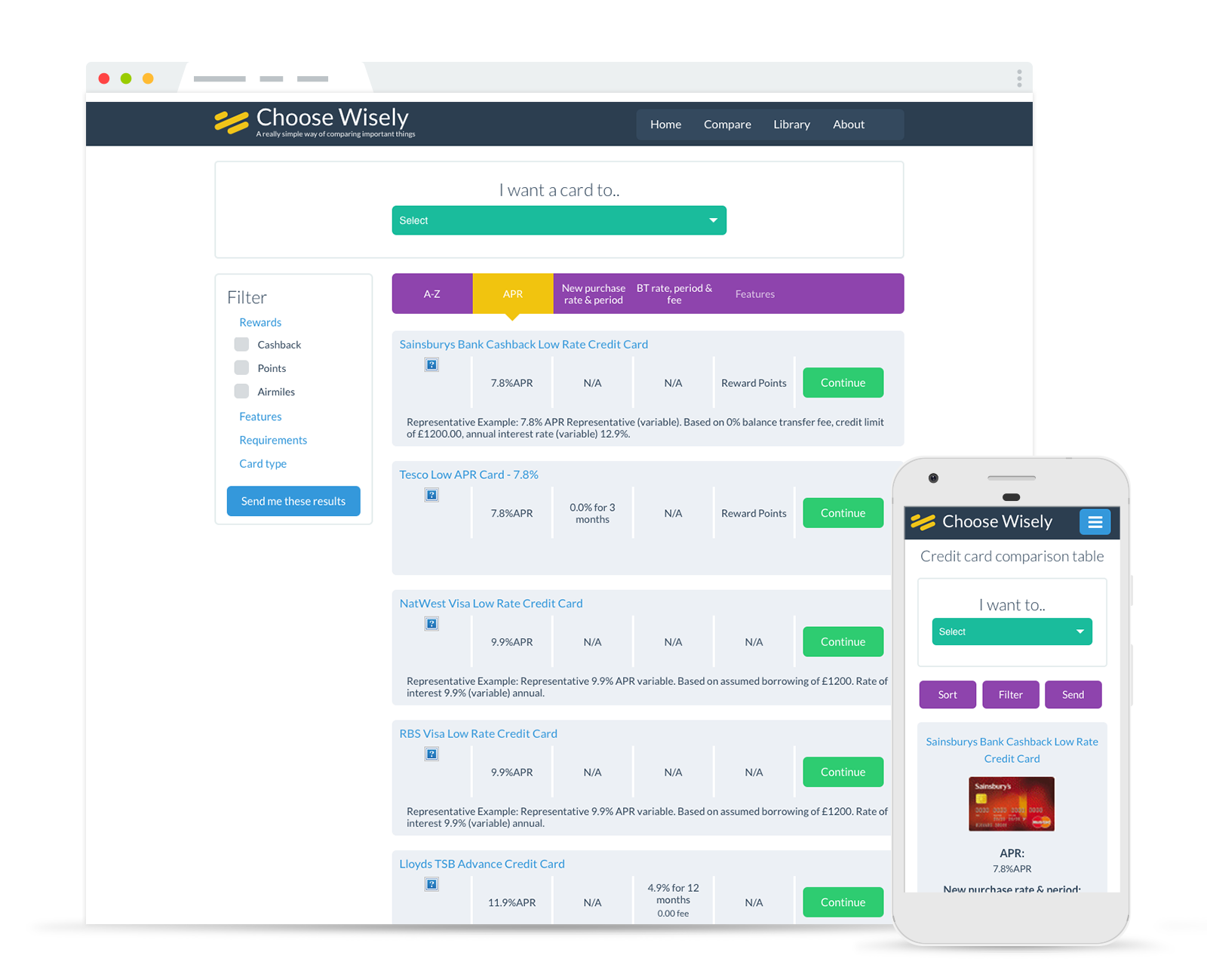
From the start Choose Wisely had been designed and built to be responsive, something no other comparison site had done.
It had to be simple, easy to navigate and easy to understand. The user had to understand what they were getting instantly. The UI was kept simple and as flexible as possible to allow maximum freedom.
We tested multiple variations of page layout, terminology, and product journeys until we found an optimum choice for production.
LET'S GET DOWN TO BUSINESS
As with any business, profitability mattered. Choose Wisely was to be based on not selling user data so another means of revenue was required.
In comes Choose Wisely Pro, a subscription-based platform. Choose Wisely Pro is analytics dashboard for Choose Wisely, where owners of products can track their products performance and identify their desired audience.
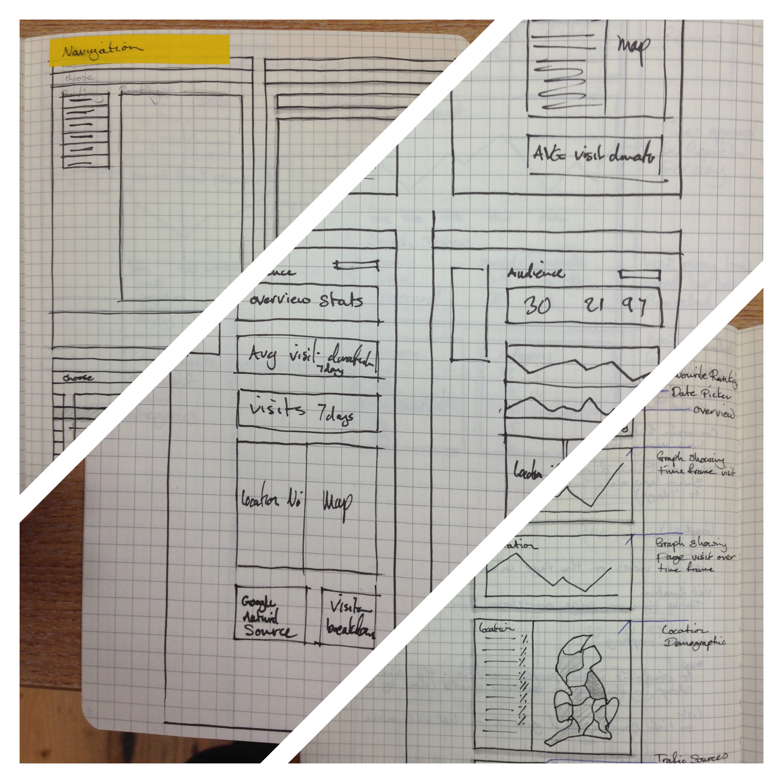
We surveyed a number of existing customers to understand what frustrations they currently had with their existing reporting and also what would help them identify market opportunities better.
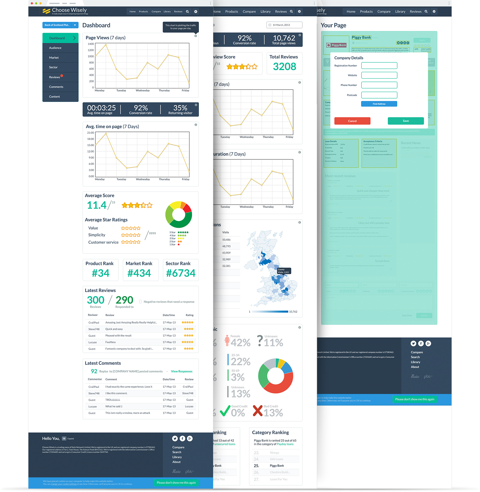
We built an ever-changing dashboard that could cater to any products needs. We included customer service metrics, demographics and also introduced some gamification with similar products.
RULE 32.
Enjoy the little things

We were pretty sure no one would ever see the 404 page but felt a little creative release was needed.
ILLUSTRATIONS
There's never a dull moment in Finance so interaction was the name of the game for Choose Wisely.
I created a series of illustrations and animations to inject some fun within the site and help create a personality for Choose Wisely.
