Intro
The theory of this concept has taken learnings from various sources of research and investigations performed on the current Wiggle and CRC website. It is also taking references from years of knowledge, experience, trends and common best practices.
Purpose + Context
This concept focus's on giving Wiggle a purpose for the customer and to push beyond the retail platform.
The designs apply customer based context and data mining - revolving around using, improving and expanding the data that we currently have as a means of serving information that’s more relevant to our customers
Product details page
Thought we might as well start off with the most important page of any e-commerce website as it's where customers do their research and make their decision to purchase.
It's also where over half of new customers come in and where the majority of customers bounce from.
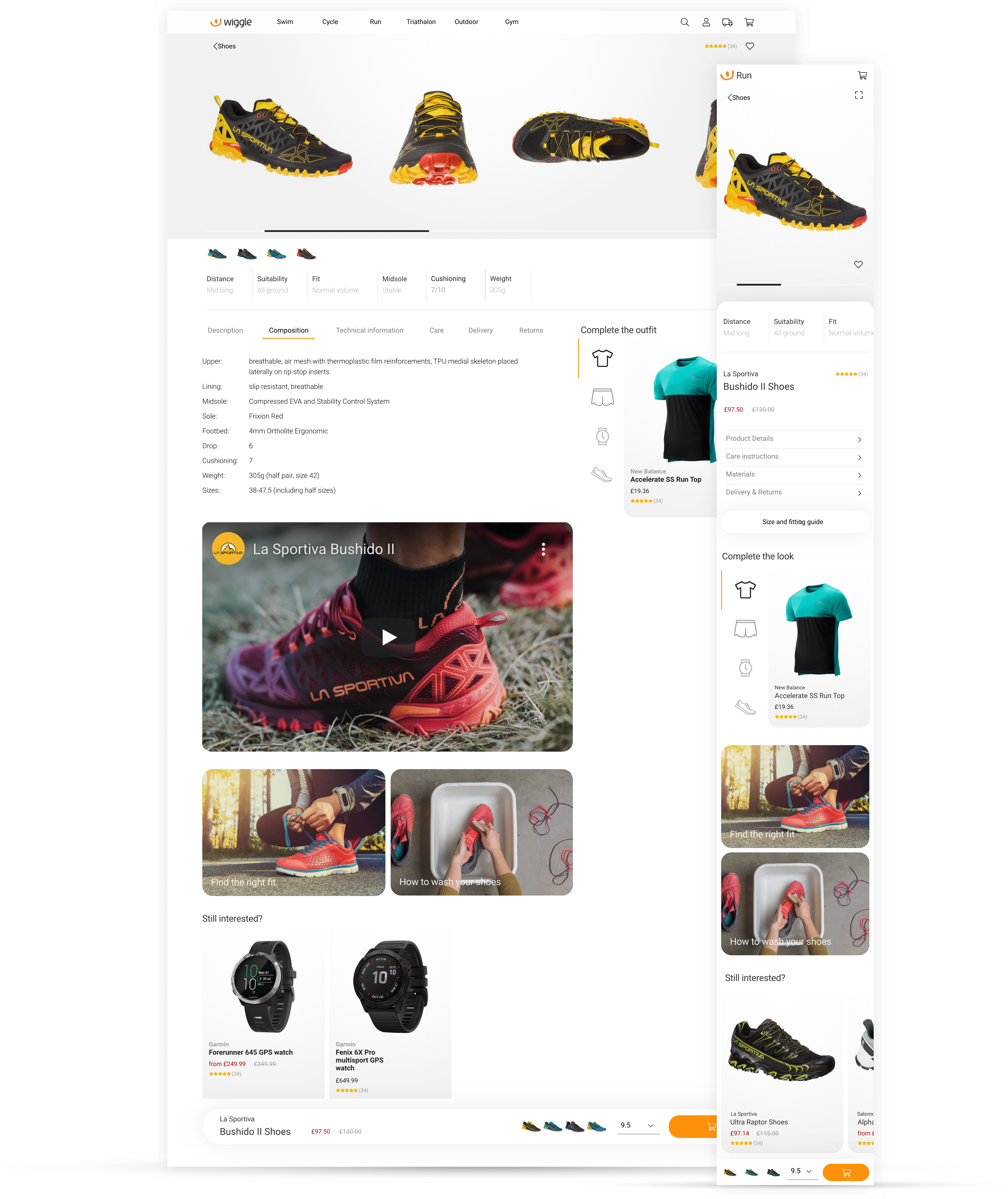
This concept focus's on data and serving the correct data to the customer at the right point. This is so a well informed decision can be made quickly and clearly.
Large imagery carousel to give the customer the best possible view of the product. This keeps the visceral desire response high and interactions or distractions minimal.
There's also a product break down - How the product was designed, it's suitability and any other key information that the customer can relate to and uses to help determine if the product is right for them.
Not everyone is an elite and knows what they're looking for. Using relevant content on product description pages could help decrease the bounce rate and potentially cross sell items.
Product listing pages
The product listing pages have been cleaned up given more customer directions. They still do the same job but just a bit smarter.
Instead of large format page headers we've incorporated relevant guides, articles and promotions into half the space. This gives the customer guidance to help make their decisions further down the page should they need it without pushing products out of sight.
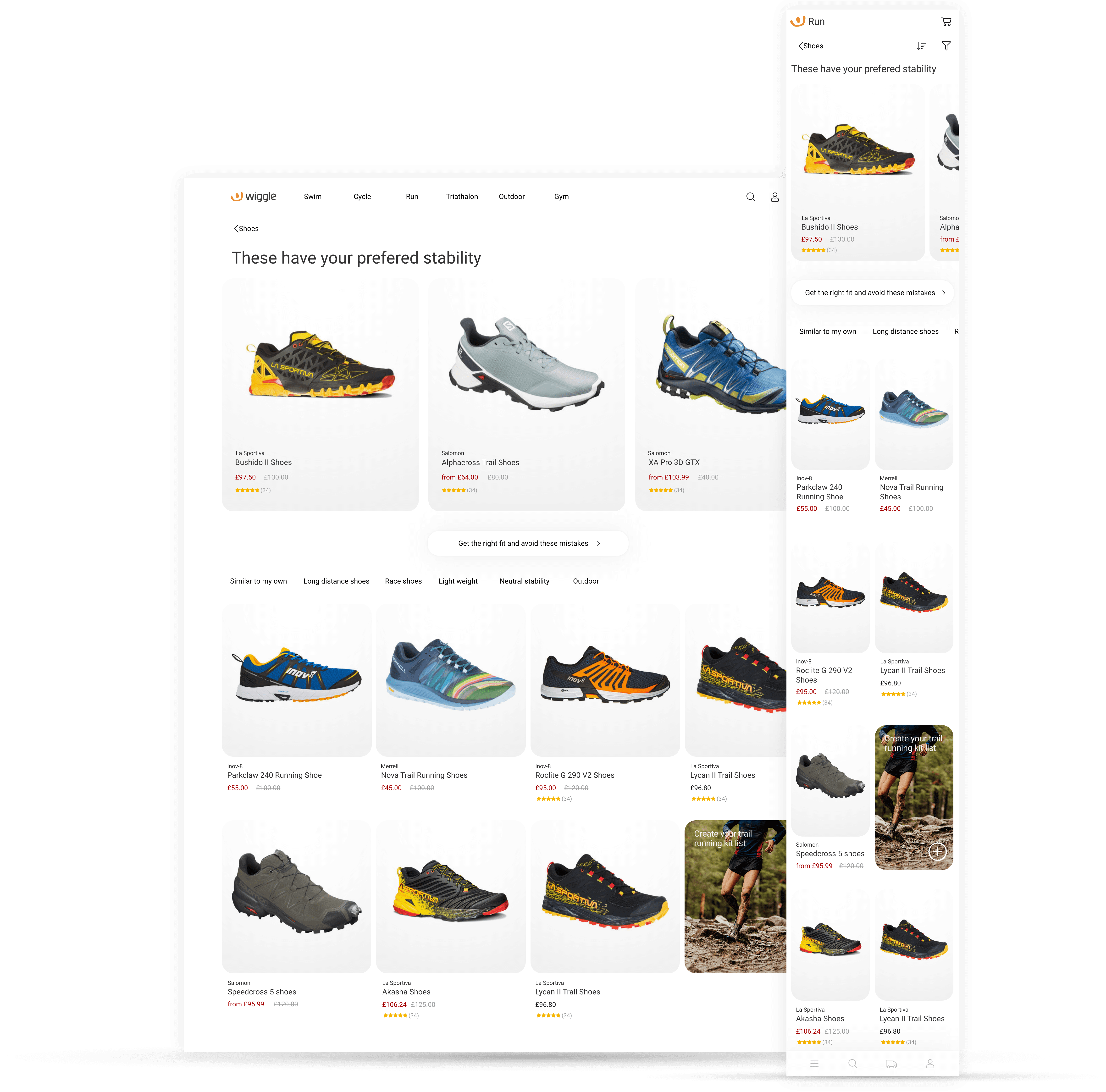
Listening to the customers needs, want and desires the PLP serves up content based on preference and when they're likely to need a suggestion.
Tailored product selection to show case like minded products based on the customers product preferences. e.g shoe stability.
Product listings have taken on a simpler form. Loyalty level is treated at an account level rather than an individual product level and loyalty prices are treated as normal pricing. This allows the sale items to stand out more
Colour SKU's are now listed individually, this is to help the customer have better visibility of choices, help with filtering and easier to understand pricing.
Homepage
The homepage has lost its spot at the top of "Most important" page leader board in recent years. While it does still receive traffic, customers have found numerous and more direct side doors into our website via google, google shopping, instagram, facebook, and twitter.
The value of the homepage is four times more for a returning customer than it is a new one.
This approach has been to treat the homepage as an orientation page, a back to the map view while still adhering to the main concept theory.
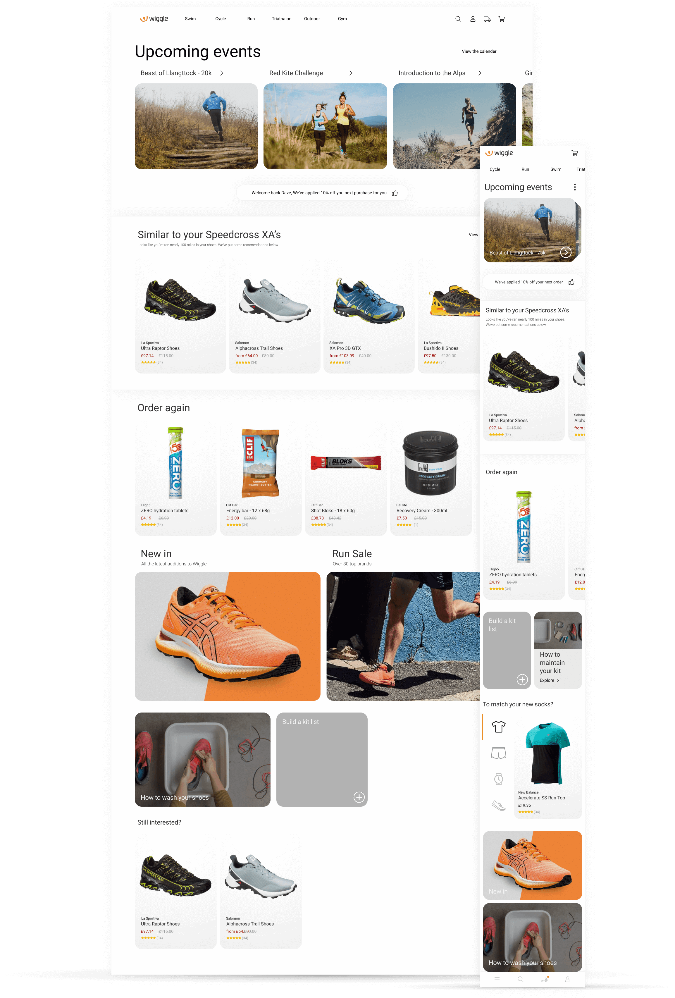
The homepage has now changed into a returning customer hub. Covering the main reasons customers should want to come back.
Reason No1 - We know what you want to do
The brand managers create years event/ marketing calendars. These have been put into Wiggle for different disciplines and we're now serving that content to the customer. This allows for the brand managers to create their own marketing campaigns and the creation of event specific informational and marketing pages.
Reason No2 - Loyalty discounts + more
The loyalty discount still exists but extra loyalty discounts will be scheduled in. Loyalty customers bring in the majority of our revenue and there's some animosity among our following with the more favourable treatment of new customers.
Reason No3 - We know what you want and when
We know what customers buy and how frequently, it's time to start using that data to our advantage.
If they've bought shoes - can we use their strava data to track how far we think they've run and start recommending around the end of life.
If they've bought nutrition - How often do they do and do they buy the same stuff? Could we allow them to shop quick or offer some alternative.
If they've bought clothing - Could we recommend complimentary items? How often do they buy? is it seasonal?
Reason No4 - Not everyone is an elite
We should not expect customers to know what they're looking for or how to shop for it. The new site should be full of sign posts for the customer to move onto should they need.
Additional screens
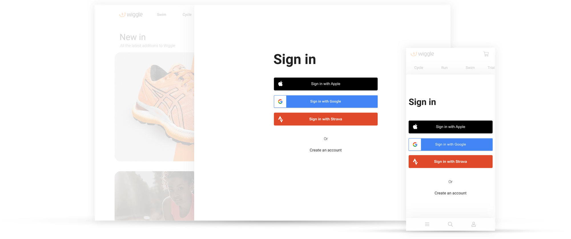
The sign in page is refocused on the majority of customers that visit it. This concept is giving Wiggle customer an easer, more secure way to log in.
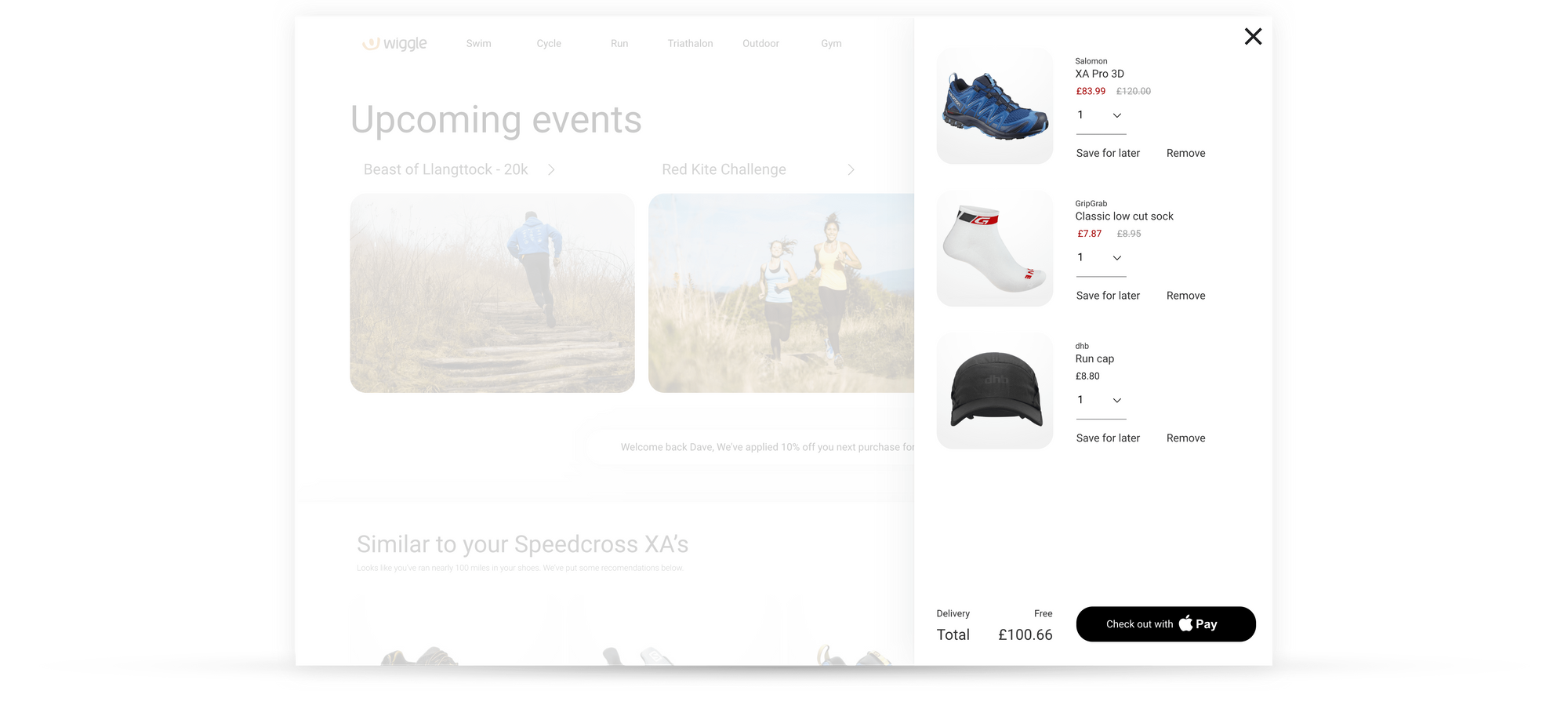
The shopping basket no longer takes the customer away from where they were and they're now quickly able to see their basket.
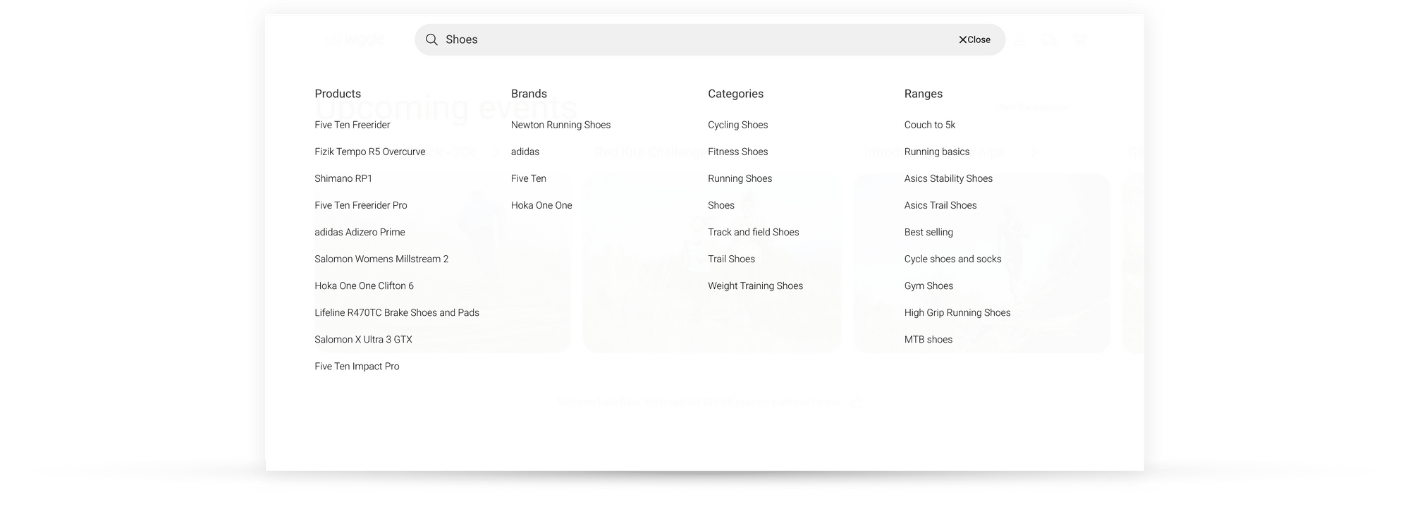
Maximising the space available the results are displayed in clearly defined columns to get a better overview.
Prototypes
Built in inVision studio, this was more of an exercise in trying new software to see how well it handled transitions and animations.